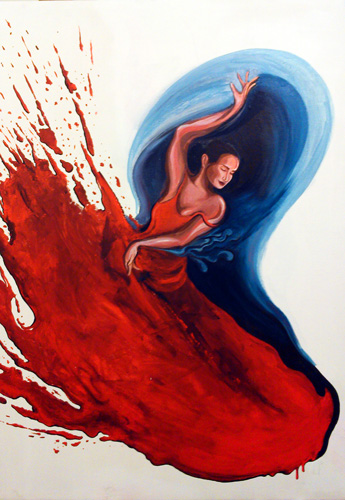
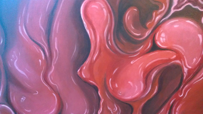
Since my grandmother passed away recently, my folks have been clearing out her old apartment and finding closets full of art supplies – pristine boxes of oil paints, bundles of brushes, and a number of rolls of canvas. There were also two stretched canvases – I decided to tackle one of them while I was visiting family for two weeks in Bombay. The painting ended up being a perfect example of the way I love to develop my compositions.
I really had a desire to fling red paint at the canvas (yeah, red again – go figure). Since that wasn’t an option at my parents’ place, I decided to paint a splatter. It was relatively free-form and loose (just short of actually flinging the paint). While I was developing the splatter a female form started to take shape, which eventually ended up being a dancer. I went with it, and then covered up the parts of the splatter that I didn’t like with some dark blue-black paint, going with curved lines to enhance the form of her movement.
After playing some more, the curved form took shape as a wave – mainly because I started mixing some white paint in with the blue-black, and turned it more blue. I’ve been itching to paint more “flung” liquid since I painted the wine flying through Chamber 51, and that ended up being the most fun part of painting this one too. I really love those liquid textures – I’m sure I’ll be doing that some more.
I was staring at a photo of the painting so far in my phone in a taxi late at night when I realized that the whole thing was starting to resemble a flower. Probably wouldn’t have made that connection without seeing it in miniature. Went at it the next morning and it worked – and now the whole painting suddenly became all about the flower. Love it when that happens.
I was mostly done – or at least I thought I was, and my parents had an artist friend, Delna Dastur, over for tea. We started discussing my painting and she said she thought it wasn’t done yet – the background needed to be something other than white. I agreed, but I was hesitant because it would be hard to lay color down so late in the game – the paint splatter especially would have been hard to negotiate. Plus, I would be leaving in a day. She said “It’s always worth the risk”, and as soon as she left I used a rag dipped in watered-down paint to roughly dab a thin wash of indigo over the white. Took around 5 minutes and it was done – thanks Delna!
In the summer between my junior and senior year at college I had the easiest job I’ve ever had. I was the “Gallery Guard” at the Wriston Art Center at Lawrence University in Appleton, WI. My responsibilities included using a handheld clicker to count the number of visitors, and making sure that nobody touched any of the art. Sometimes I didn’t have to reach for the clicker all day. Honestly the toughest part of the job was not falling asleep, a requirement that was made even harder by the fact that I had carried over a very comfortable armchair from a nearby frat house to the art center for myself to sit on all day. Afternoons were the hardest to get through.
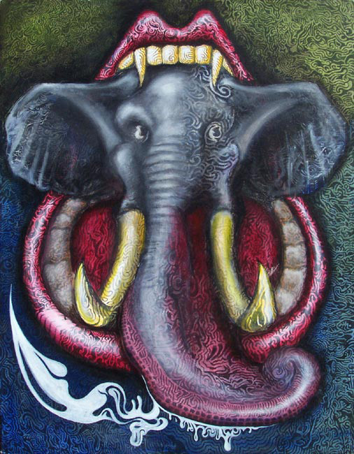
First I set about devouring Tom Robbins’ entire catalog. When that was done, I went for Herman Hesse. I made it through Steppenwolf, but Siddhartha had me falling asleep every few minutes, so I needed something else to do. I decided to grab a black Sharpie and start doodling on a blank canvas.
India – 26″ x 34″ – acrylic on canvas
At first the doodle was completely free-form. I wasn’t trying to create anything in particular. I remember envisioning just a big swirling black-and-white pattern. Though I was specifically trying to avoid creating a recognizable image, it didn’t take long for an image to form. At first it was just the mouth. I didn’t quite know what was going to go in the mouth so I left the inside blank and just finished doodling around it. The form of an elephant took root because the tongue started looking like a trunk. Eventually it ended up being a large black-and-white trippy doodle of an elephant being devoured by a mouth – and it stayed that way for around six months because I thought I was done with it. I’ve hunted high and low for a photo of it at this stage, but even though I know I took one, I can’t find it. Maybe I’ll update this post at some later date if I find it.
Fast forward to my final semester in college. I’ve taken forever to finish The Kiss, so I have very little time left to complete the last painting that I was required to. Suddenly I remembered the elephant sitting against the wall in my dorm room. That was practically complete even though it didn’t yet have a drop of paint on it. So I went to work using thin glazes of paint so I didn’t obscure too much of the detail I had put so much effort into. The coloring was complete in a couple of hours and I submitted it as my final painting.
I named the painting “India” because everyone kept calling it Ganesha (it’s not – Ganesha is always represented with a broken tusk – my elephant has no such dental issues). I also think that it looks more like an African Elephant than an Indian one, but…
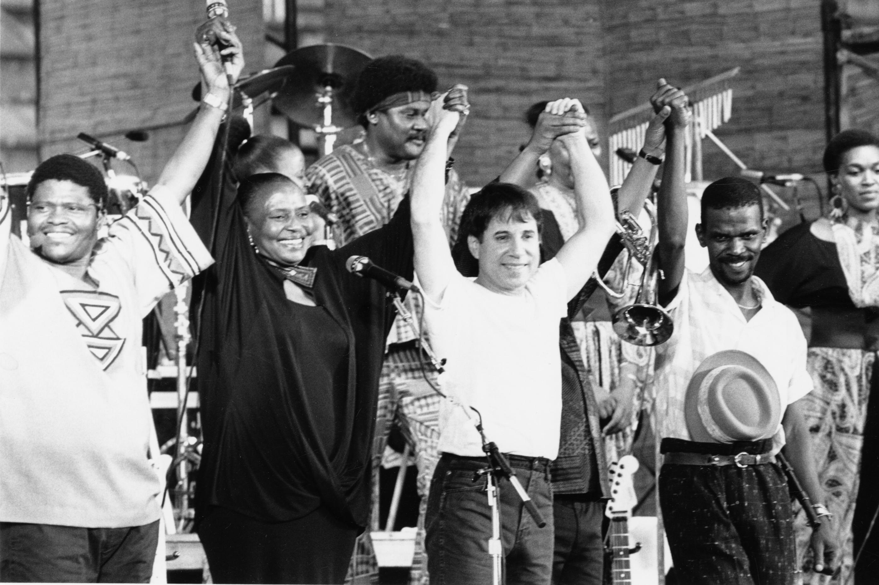
Under African Skies, Joe Berlinger’s documentary about the making of Paul Simon’s Graceland album, opened in New York and Los Angeles this week, and I was lucky enough to get to see it twice. The film is exhilarating and heartwarming as it explores the cultural phenomenon of one of the greatest albums ever made, and the stories of the South African musicians who played both on the album and the world tour that followed. Even if it merely focused on the music, it would still blow away any documentary about the making of an album, but it also has another, more potent, layer. It is entirely framed within a political argument that was seething at the time – an argument that as a child of the 80s, I was blissfully unaware of when I first grew to love the music on the record. I want to break with my usual musings on my own art to discuss my thoughts on the film in this post. Warning: spoilers below, if you have not seen the film please, please, go see it – it is absolutely wonderful.
In the mid-80s, Paul Simon became obsessed with South African music, but rather than round up accomplished musicians in New York to replicate the sound for his new album, he decided to travel to South Africa to collaborate with the masters. The problem was that he did this in violation of the United Nations’ boycott of South Africa’s apartheid government, and at a particularly inopportune moment for the liberation struggle. The documentary is speckled with images and videos of protests and furious confrontations that arose after Graceland’s release, and its backdrop is a tense discussion between Paul Simon and Dali Tambo, the founder of Artists Against Apartheid, which runs throughout the film.
During the film, arguments are made on both sides. Dali Tambo and Wally Serote continually reiterate how problematic it was for Paul Simon to flagrantly violate the cultural boycott, and how important it was to keep the racist regime isolated. Simon’s camp makes the argument that as artists they should have been allowed a pass, that he meant no harm, and that it was a wonderful life-changing experience for everyone involved in the project – a point that is hammered into the audience through intensely emotional scenes of oppressed musicians finally tasting freedom. Even though the film is primarily about celebrating the music that resulted from the collaboration, the film tries to be as neutral as possible in its presentation of the debate. Though it is abundantly clear that even 25 years later, Simon remains deeply hurt by the criticism, the film concludes with a “reconciliation” – a handshake and hug – where Paul Simon acknowledges his mistakes and apologizes for any harm he caused, and Dali Tambo professes that he and his organization hold no grudge, the music was brilliant, and that Simon was merely caught up in the whirlpool of a political struggle. The viewer is left without a clear resolution or opinion and the general conclusion is that it remains a complex issue with no clear correct answer…he was probably wrong to do it, but we’re glad he did because the music was so good.
However, I don’t think of this as a grey issue where the truth lies somewhere in between. Even though Paul Simon didn’t set out to specifically violate the boycott, I think he was right to do what he did, and wrong to apologize for it – mainly because I question the idea of a cultural boycott in the first place. This is something that the film doesn’t do – it merely dances around whether Simon was right to break it and the implications of making an exception for him. I’m of the opinion that the cultural boycott was not just wrong, but misguided and counter-productive.
History is brimming with examples of art making a difference in political struggles. Art is and will always be one of the most potent forces that drives people to change. It moves the human soul in a deeper and more profound way than any rational argument has a hope of doing. From Beaumarchais’ Marriage of Figaro to Stowe’s Uncle Tom to Bob Marley’s anthems, art has changed opinions and incited and inspired protest. Could you even imagine the anti-Vietnam-war movement without the soundtrack of the 60s to fan the flames? While Ellen DeGeneres would probably take issue with Joe Biden’s recent quip about Will and Grace’s supreme influence on public opinion about gay people, the point remains valid. Art inspires change. To censor your most powerful weapon in a protest is to shoot yourself in the foot – and that’s what the ANC and Artist Against Apartheid did. Isolating a morally corrupt regime is effective – there is no doubt about that. But while a trade boycott may hurt the regime as it is intended, a cultural boycott hurts the liberation movement because it prevents the most influential and moving voices from making themselves heard to a wider audience, with the result that it actually shields the regime from people who would have been moved to support the movement in other corners of the world.
Paul Simon’s visit and subsequent world tour were subjected to intense criticism and vitriol because the dogma of a cultural boycott went unquestioned. Since the heavyweights of the liberation struggle decreed that art should be treated no different from trade in the isolation of the regime, any violation was perceived as pro-apartheid. But the ANC could not possibly have been ignorant of the fact that within South Africa, artists were integral to the anti-apartheid movement. Throughout the history of segregation, protest music gave black South Africans hope and courage to continue and eventually win the fight – which is what makes the restriction on their creative expression even more damning. Artist Against Apartheid and the ANC should accept the blame, not just for the harm their cultural boycott did to the muted artists of South Africa, but for making it harder for their cause to garner support all over the world. Thankfully, an unlikely and unwilling revolutionary emerged in a diminutive New Yorker. Paul Simon, who started out largely apathetic to the cause and unconcerned with the struggle, eventually ended up taking grave personal risks for his art and on the behalf of the musicians who helped him achieve the zenith of his career. He confronted the boycott, and won. And the world is a better place because of Graceland.
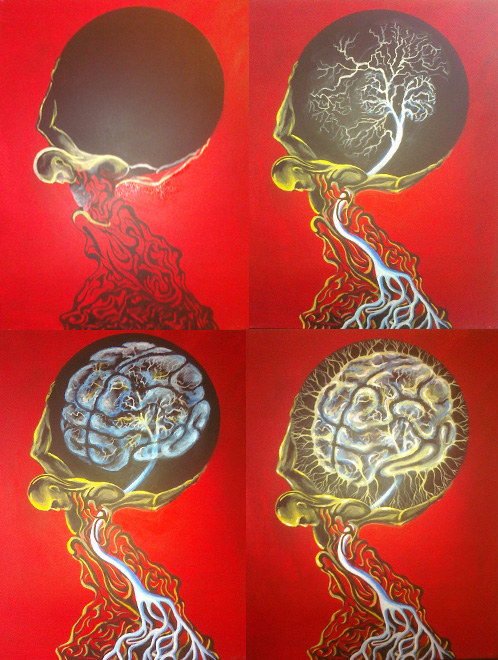
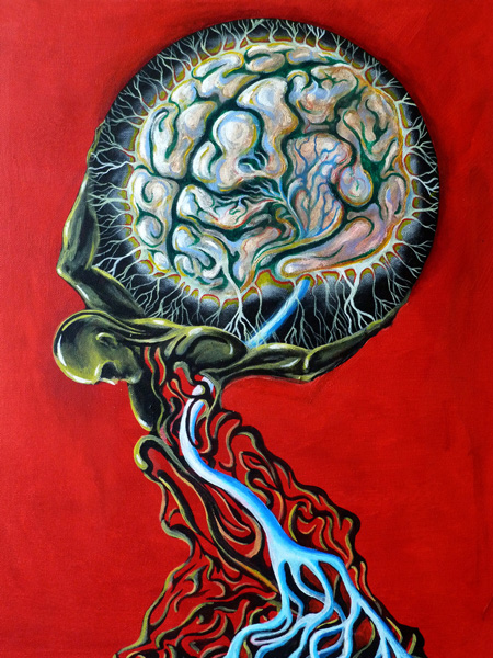
The canvas on which Atlas ended up started out as a painting called “Improv in C-minor”. Even though I did take a photograph of it, it was never complete in my mind and at one point I decided to try adding some translucent layers to it – completely ruined it, got mad at myself for messing it up and then just painted the whole thing red. That was the end of that.
The red canvas sat around for a while, then I doodled some black paint on it, and again ignored it for a couple of years. There were a few failed attempts to create something interesting with plain black on a red background, that ended up being nixed with a big black ball. Finally Atlas emerged, carrying the ball and the painting finally had a direction.
OK, so now here was Atlas carrying a big black ball. The question of what should go in the ball was posed to a few friends. My friend Leslie suggested a tree – that seemed promising, so I set to work. The green wasn’t showing up too well on the black, so I decided to chalk it out with white first, as I often do when starting to paint on a dark background. All of a sudden the branches started to look like neurons and so I began to work on a brain instead. The brain took some refining and re-working. I abandoned early attempts to make it translucent in favor of a more fleshy feel.
The name Atlas Drugged came from my neighbor at the time, Alex – they were literally the first words out of his mouth when he saw it, and it stuck.
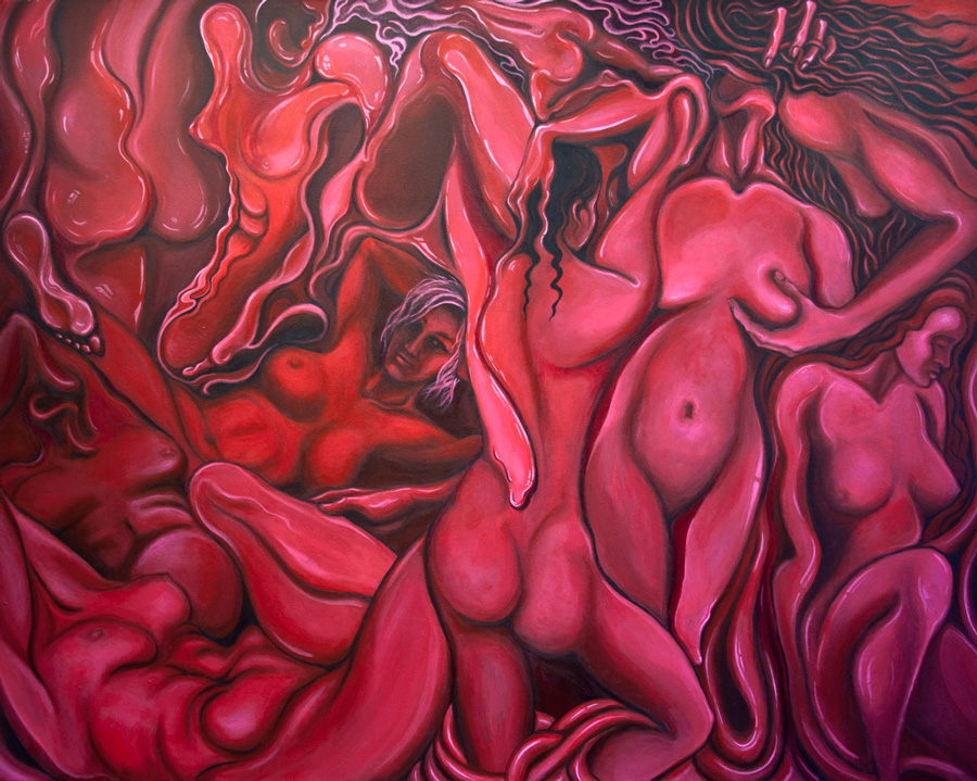
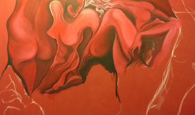
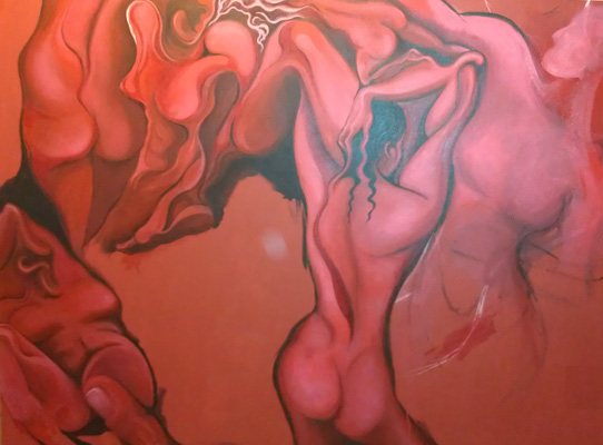
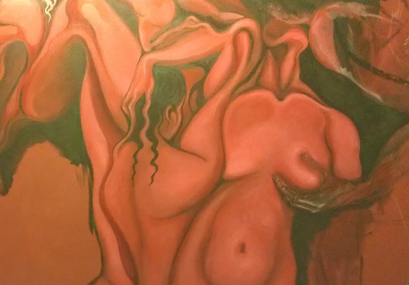
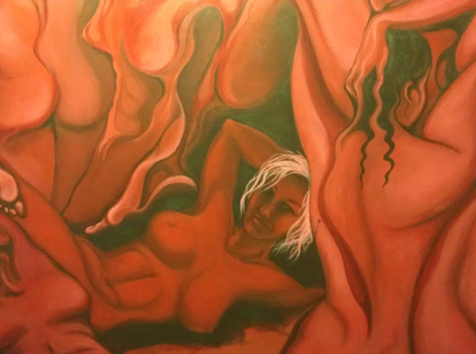
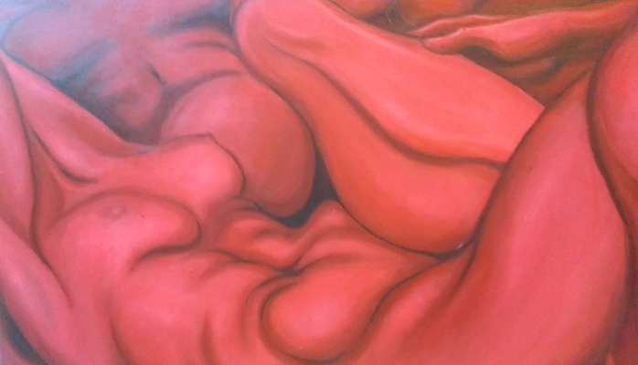
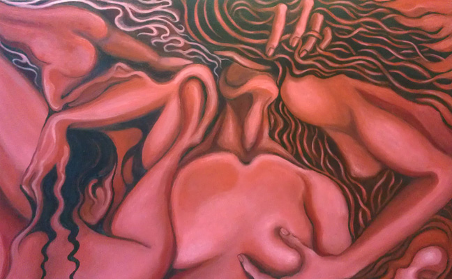
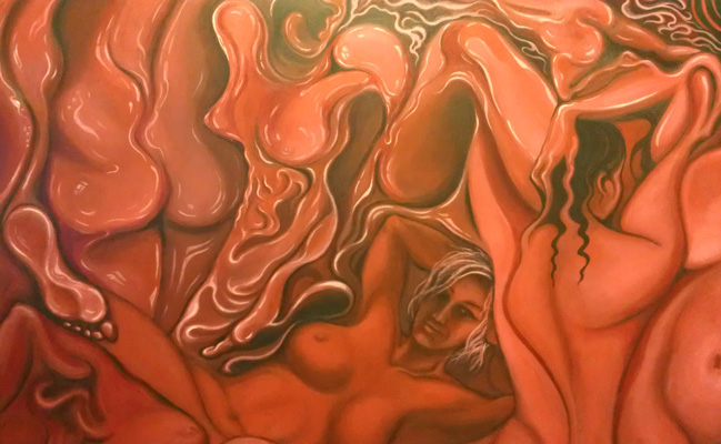
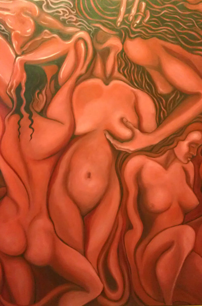
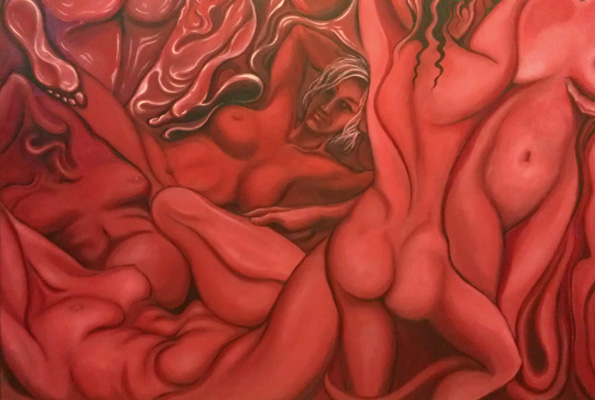
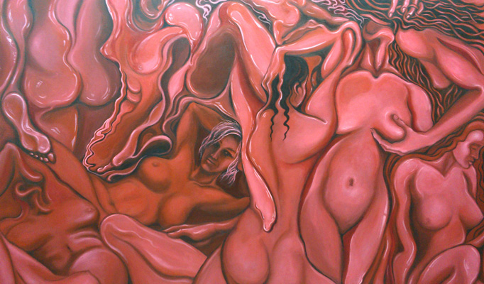
Been having a bit of an obsession with red recently. After painting a wall in my apartment burgundy, I had a bunch of leftover paint, so that’s how I began this canvas. It’s a big one – 5 feet long, 4 feet high.
It’s been a few years since I painted Sensuality and I’ve always wanted to create more works in that slimy soft style. That was the original idea with this one but I decided to go with red instead of orange as the base. The female form in Sensuality emerged after an improvisation, but for this one I decided to chalk some in from the start and work around them. As you can see from the photos I took as it was progressing, at the start the figures were much more loosely defined and distorted. But as the composition started to fill in, I began to have more fun with creating better defined female forms so I just went with it. The painting ended up racier that I had originally intended too…not that that’s a bad thing.
A couple more things I’d like to say about this painting. First of all, I’m not 100% sure that I’m done. It could be complete as it is now, but it might need a couple of finishing touches still. I like the monochrome red, but it’s hard not to feel like it’s lacking something. Also I cannot for the life of me figure out how to capture the richness of the color on film. I’ve tried a bunch of different cameras and settings and different types of lighting, but I still haven’t been able to reproduce the colors to my liking. I’ve had the same trouble with a couple of other painting where red is dominant – most notably Lasya. If anyone has any ideas, please let me know.
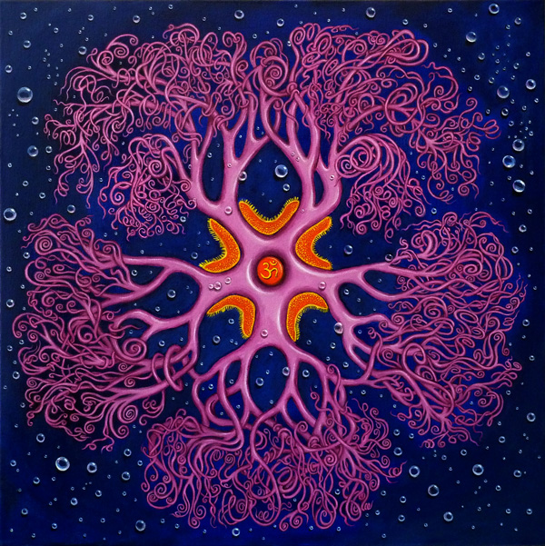
In late 2010 I was lucky enough to meet Sebastian Kvist, a PHD student at the Museum of Natural History in New York. Within hours of meeting him I was peppering him with questions about biology – not doing much to conceal my enthusiasm for the subject. He was kind enough to invite me and a friend on a personal tour of his lab and the innards of the museum. It was one of the most amazing experiences – I’ve been back twice since.
Giant Lobster
The Museum has some pretty incredible things going on behind the scenes in the labs. There’s cabinets filled with skeletons of dolphins, bears, crazy looking rodents and a particularly weird primate with a steampunk pelvis. There’s a room filled with elephant skulls and another with hippo skulls. There’s even two massive Galapagos giant tortoises who roam the hallways! After meeting some of his colleagues and checking out some other labs, we headed for the wet rooms. Sebastian studies leeches, so we started our tour with the invertebrates. Picture seemingly endless hallways with wall-to-wall filing cabinets, all containing the most fascinating creatures. Some in jars, some dried and brittle. Jellyfish, sea urchins, starfish, crustaceans – all beautifully preserved and labeled. There was a giant Isopod and the biggest lobster I’ve ever seen, that Sebastian lifted out of its tank so we could take a closer look. The most spectacular thing there was a giant squid in a 25 foot tank. We managed to take a close look at one of its tentacles with razor sharp suction cups. Quite amazing.
Squid TentacleGiant IsopodBut the animal that impressed me most during the visit was something I didn’t even know existed before I was staring at a dried specimen. The Gorgonocephalus is a starfish-like radially symmetrical creature with blooming curly tentacles at the end of each arm that are used for locomotion. Even dried, brittle, and colorless, it had a beautiful elegance that captivated me, so I set about painting it. I’m eternally grateful to Sebastian for his generosity in taking me on multiple tours through the museum, and will remain indebted to him for introducing me to this wonderful creature.
I didn’t really take many liberties with the form of the creature. I chose to paint it purple because I liked the way the purple in “Jellin” had stood out against the deep blue background. It was immensely time consuming to paint the tentacles in the meticulous detail that I chose, but once I started I had no option but to go through with it. Not quite sure what inspired me to put an “Om” symbol over the mouth – it just seemed to work there.
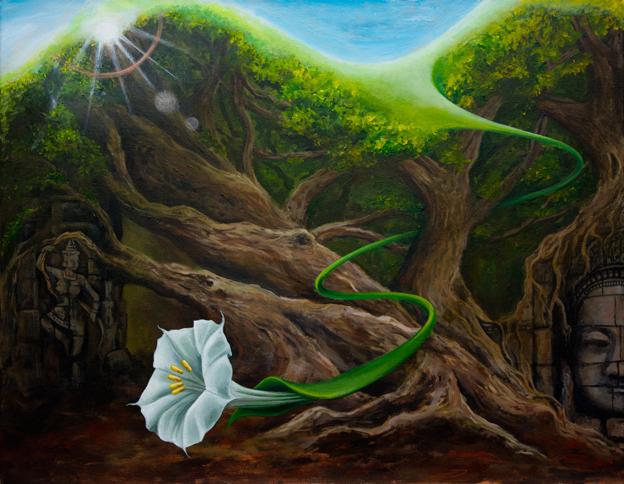
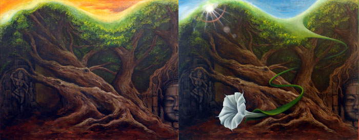
An explosion of light comes crackling through the branches as a trumpet Lilly heralds the dawning of a new age. Below, crumbling idols are the vestiges of the old, and above, the trees’ vibrant greens are the fountains of the new. Yet while the reason of the new age supersedes the superstition of the old, it is built on what came before. Roots tread a fine line between absorbing age-old wisdom from the ancient rocks that they depend on for support, and breaking apart their decaying remnants. The flower carries within it a potent symbol of the new age, its stamens poised to pollinate the world with the new science of medicine that has doubled lifespans within merely a handful of generations.
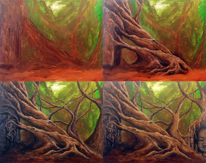
As with much of my work, the inspiration for this narrative didn’t emerge until very late in its evolution. A forest scene emerged after a quick improvisation, and as I teased out some gnarly tree trunks, I felt that ancient temples were an appropriate addition to the scene.
The sky over the canopy started out orange, but it was too jarring for me, so it became a calmer blue. The blue inspired the sunlight and the lens flare, and very soon a long green vine twisted its way out of the canopy and into the bell of a flower.
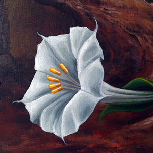
It wasn’t until I added the stamens, which turned to yellow pills, that the inspiration for the name and the theme of this piece struck me. Maybe it was in my subconscious all along, but it didn’t fully materialize until the end.
In many ways the revolution of evidence-based medicine is the age of reason’s greatest accomplishment – underscored by the fact that if I’d lived in the era before it, I’d either be dead or very close to dying by this point in my life.


 It wasn’t until I added the stamens, which turned to yellow pills, that the inspiration for the name and the theme of this piece struck me. Maybe it was in my subconscious all along, but it didn’t fully materialize until the end.
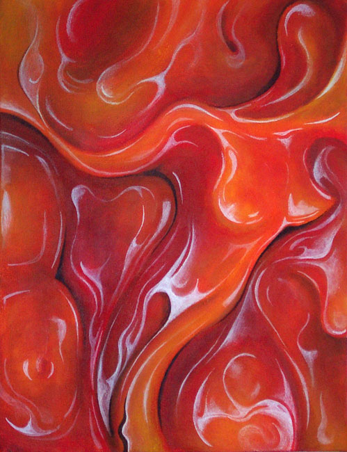